Rows: 35,096
Columns: 14
$ StateAb          <chr> "ACT", "ACT", "ACT", "ACT", "ACT", "ACT", "ACT", "ACT…
$ DivisionID       <dbl> 318, 318, 318, 318, 318, 318, 318, 318, 318, 318, 318…
$ DivisionNm       <chr> "Bean", "Bean", "Bean", "Bean", "Bean", "Bean", "Bean…
$ CountNumber      <dbl> 0, 0, 0, 0, 0, 0, 0, 0, 0, 0, 0, 0, 0, 0, 0, 0, 0, 0,…
$ BallotPosition   <dbl> 1, 1, 1, 1, 2, 2, 2, 2, 3, 3, 3, 3, 4, 4, 4, 4, 5, 5,…
$ CandidateID      <dbl> 36239, 36239, 36239, 36239, 37455, 37455, 37455, 3745…
$ Surname          <chr> "CONWAY", "CONWAY", "CONWAY", "CONWAY", "AMBARD", "AM…
$ GivenNm          <chr> "Sean", "Sean", "Sean", "Sean", "Benjamin", "Benjamin…
$ PartyAb          <chr> "UAPP", "UAPP", "UAPP", "UAPP", "ON", "ON", "ON", "ON…
$ PartyNm          <chr> "United Australia Party", "United Australia Party", "…
$ Elected          <chr> "N", "N", "N", "N", "N", "N", "N", "N", "Y", "Y", "Y"…
$ HistoricElected  <chr> "N", "N", "N", "N", "N", "N", "N", "N", "Y", "Y", "Y"…
$ CalculationType  <chr> "Preference Count", "Preference Percent", "Transfer C…
$ CalculationValue <dbl> 2831.00, 2.88, 0.00, 0.00, 2680.00, 2.72, 0.00, 0.00,…2025 Australian Federal Election
Aussie Politics
Parliament of Australia comprises two houses:
- Senate (upper house) comprising 76 senators
- House of Representatives (lower house) comprising 150 members
Government is formed by the party or coalition with majority of the seats in the lower house
The 2025 Australian Federal Election was held on Sat 3rd May 2025
The next federal election is expected on a Saturday in May in 2028
Parties
Two major parties: Labour and the Coalition. Coalition combines Liberals and Nationals.
![]()
![]()
![]()
There are also minor parties like the Greens and One Nation, and Independents.
![]()
![]()
Ballots
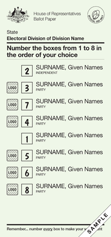
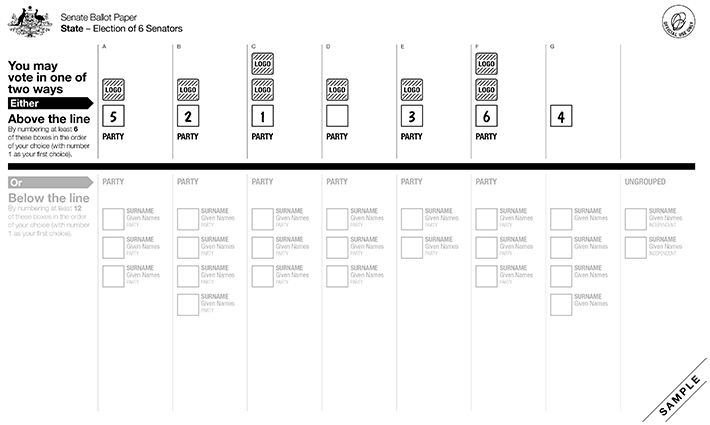
- House of Representatives uses the instant-runoff voting system
- Senate uses the single transferable voting system
 .
. 
District: Monash
Rows: 56
Columns: 14
$ StateAb          <chr> "VIC", "VIC", "VIC", "VIC", "VIC", "VIC", "VIC", "VIC…
$ DivisionID       <dbl> 323, 323, 323, 323, 323, 323, 323, 323, 323, 323, 323…
$ DivisionNm       <chr> "Monash", "Monash", "Monash", "Monash", "Monash", "Mo…
$ CountNumber      <dbl> 0, 0, 0, 0, 0, 0, 0, 0, 1, 1, 1, 1, 1, 1, 1, 1, 2, 2,…
$ BallotPosition   <dbl> 1, 2, 3, 4, 5, 6, 7, 8, 1, 2, 3, 4, 5, 6, 7, 8, 1, 2,…
$ CandidateID      <dbl> 36561, 36737, 36065, 37629, 37637, 36455, 36914, 3603…
$ Surname          <chr> "MORGAN", "BROADBENT", "LEONARD", "HICKEN", "WELSH", …
$ GivenNm          <chr> "Mat", "Russell", "Deb", "Allan", "David Matthew", "J…
$ PartyAb          <chr> "GVIC", "LP", "IND", "ON", "CYA", "ALP", "LDP", "UAPP…
$ PartyNm          <chr> "The Greens", "Liberal", "Independent", "Pauline Hans…
$ Elected          <chr> "N", "Y", "N", "N", "N", "N", "N", "N", "N", "Y", "N"…
$ HistoricElected  <chr> "N", "Y", "N", "N", "N", "N", "N", "N", "N", "Y", "N"…
$ CalculationType  <chr> "Preference Count", "Preference Count", "Preference C…
$ CalculationValue <dbl> 9533, 36546, 10372, 7289, 674, 24759, 3548, 3991, 959…
Visualising the counts
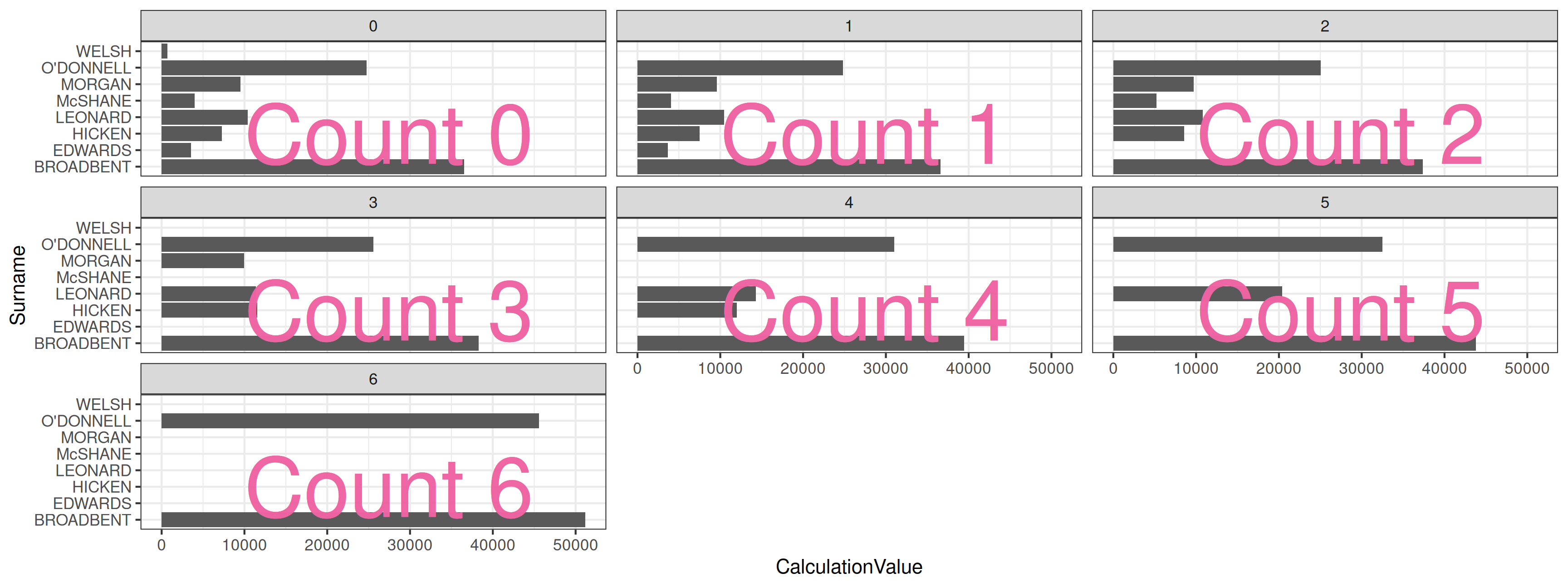
Better
Order candidates by counts!!!
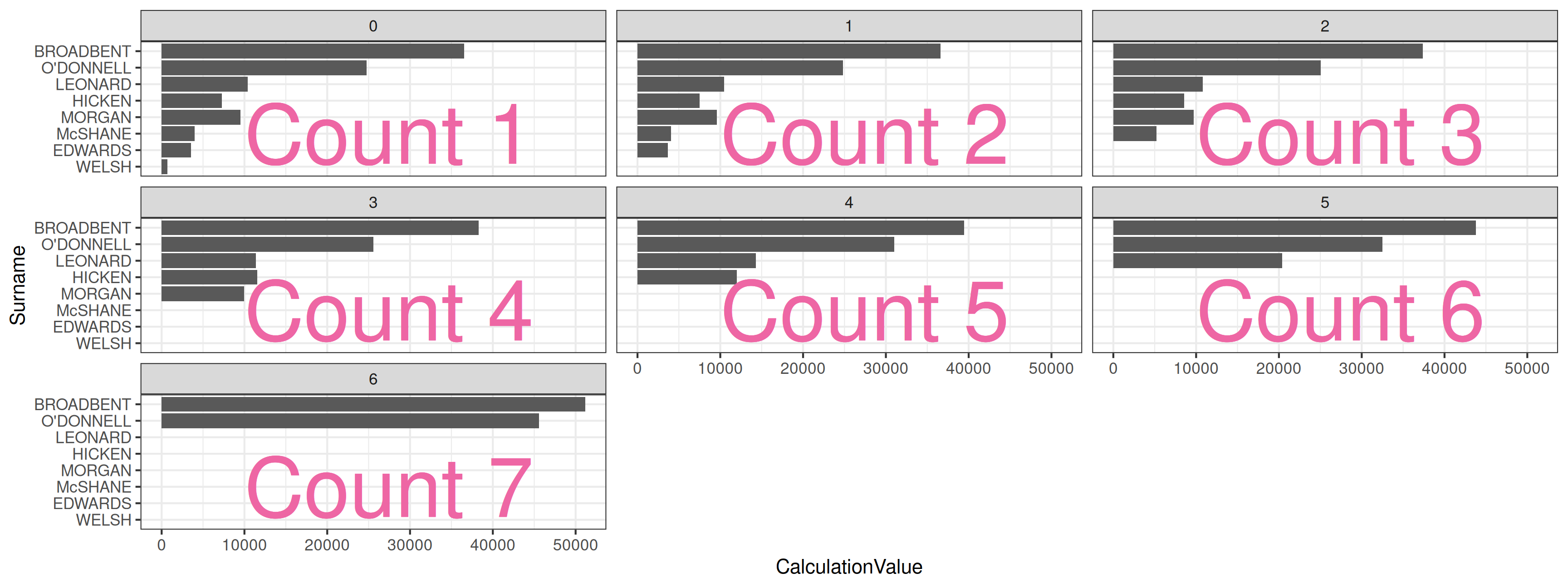
Winner:
Russel
Broadbent
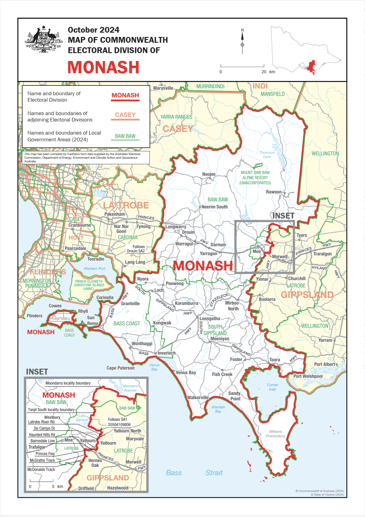
Where is the electoral district of Monash?
It doesn’t include Monash Clayton campus- Check here.
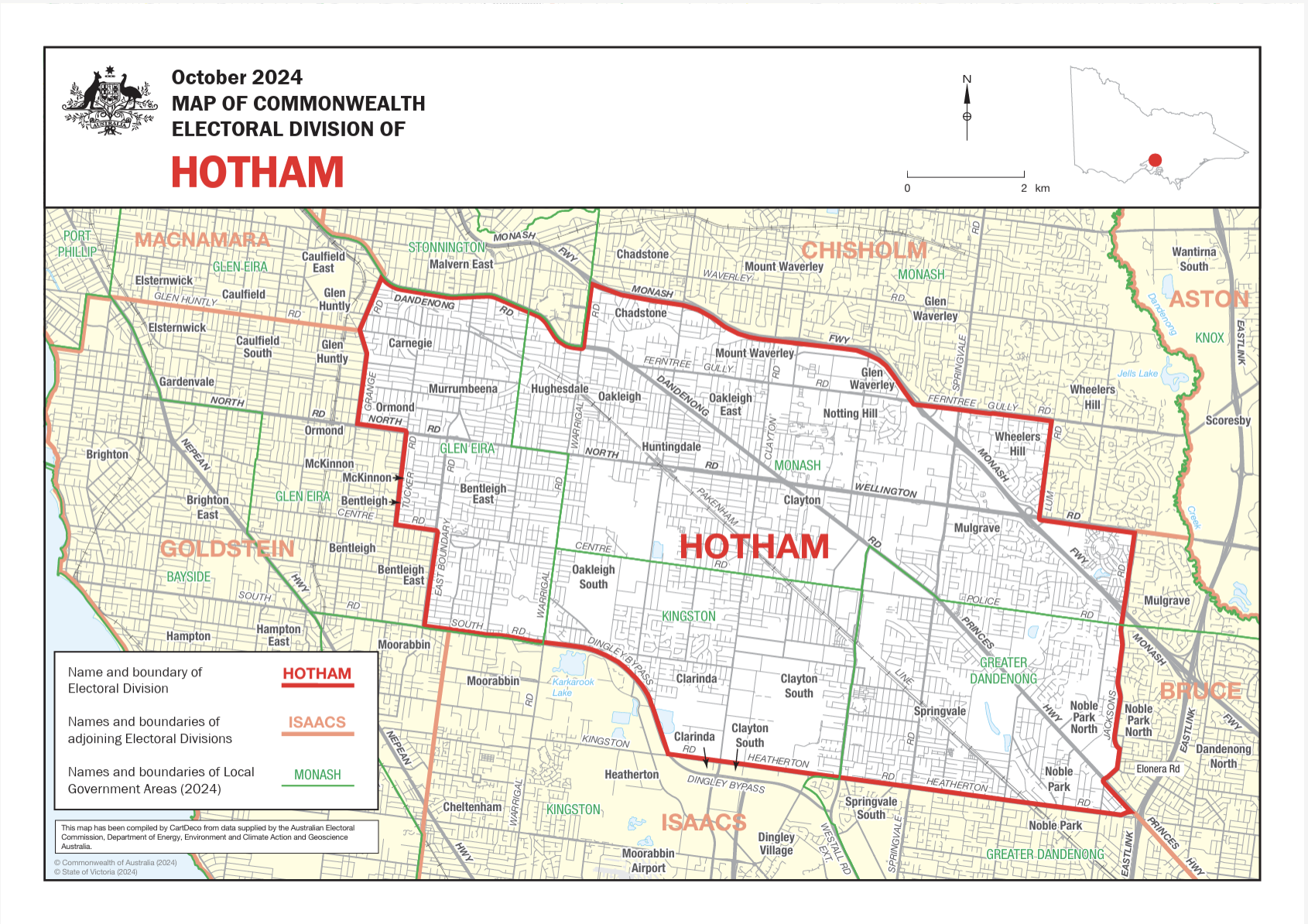
Electoral district of Hotham
Does include Monash Clayton campus - Check here.
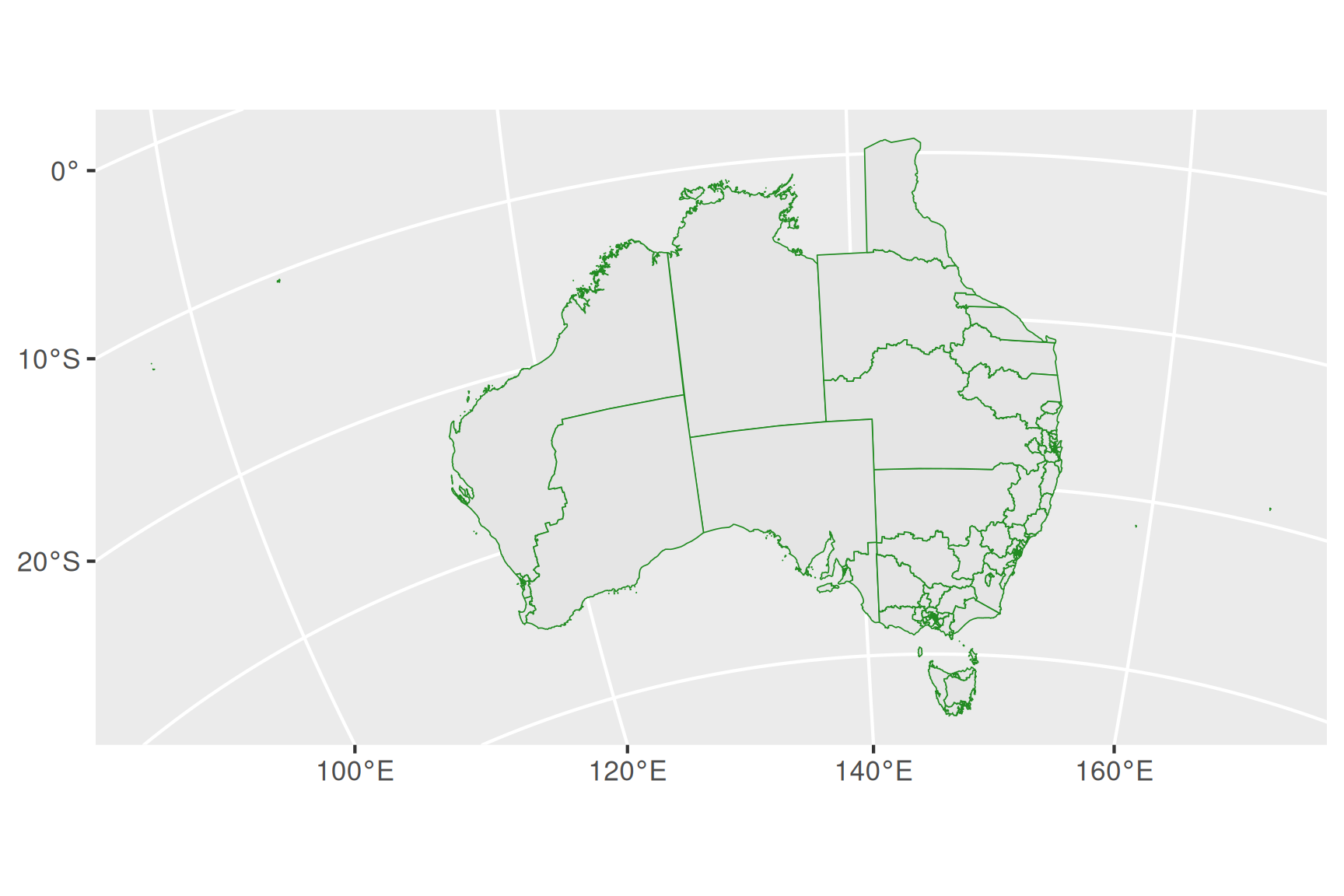
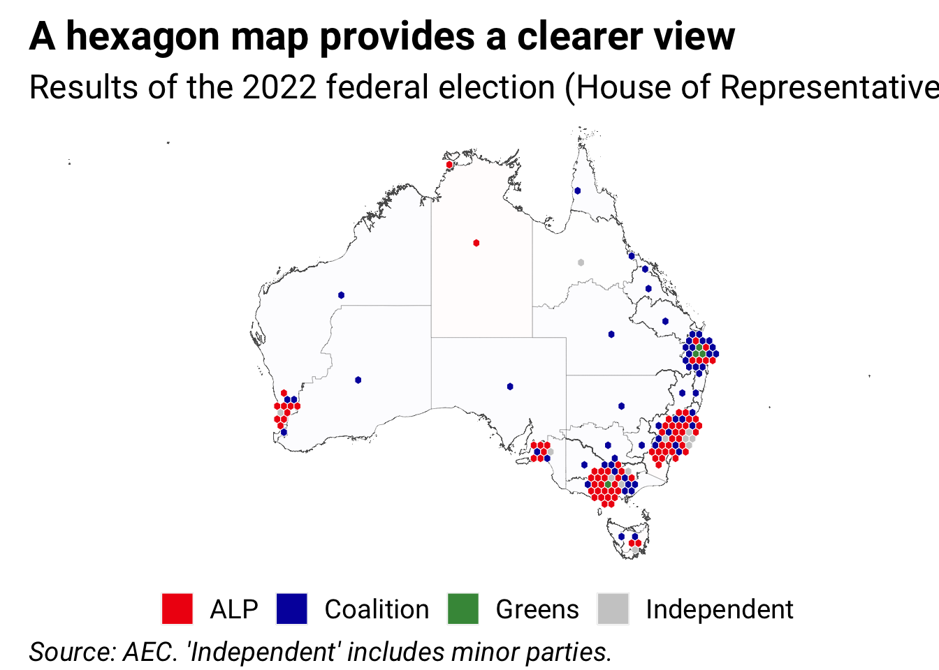
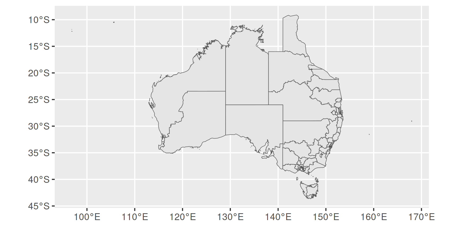
Australian Electorates Divisions
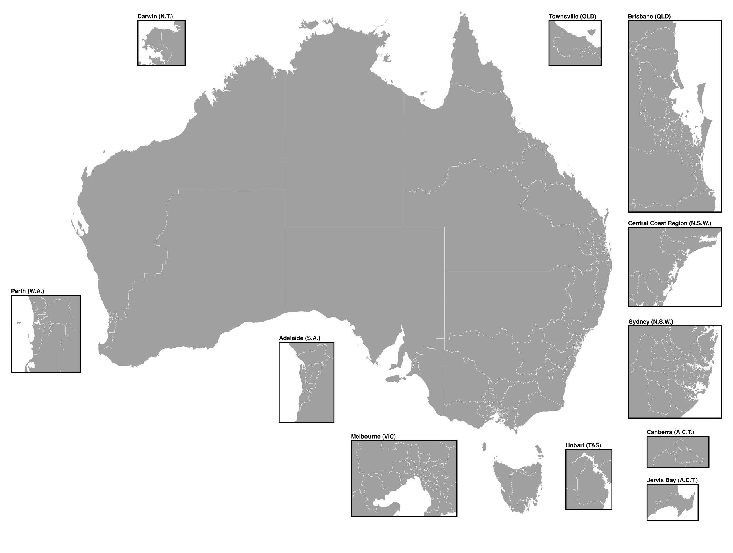
There were 151 electorates in 2022.
Visualisation in ggplot
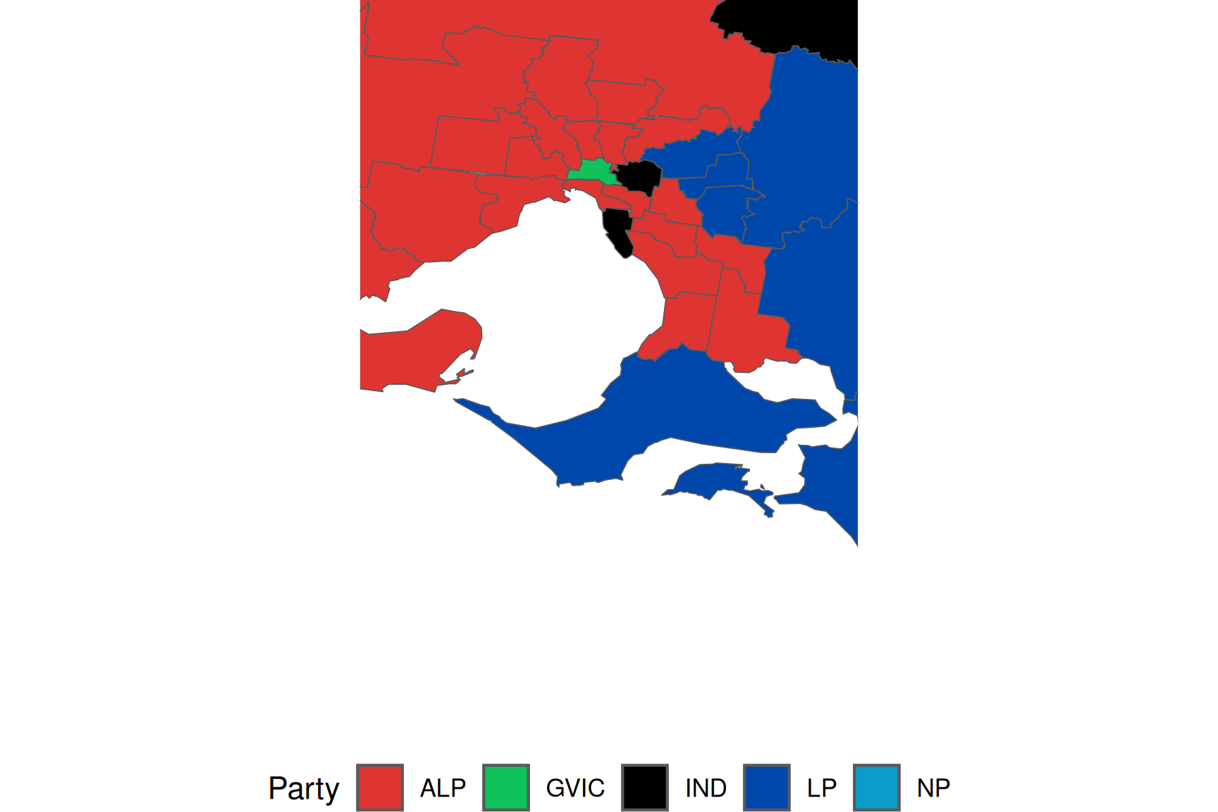
Combining election winners and map
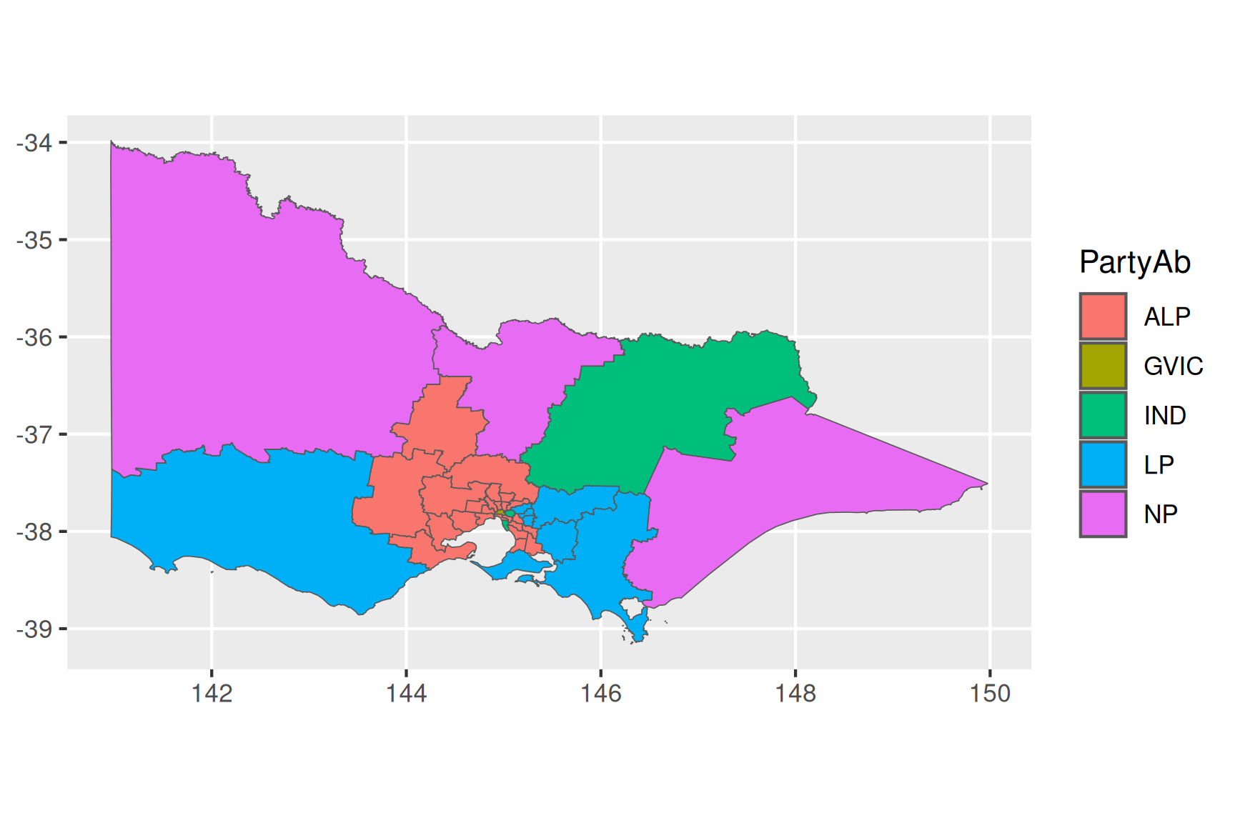
Using colors wisely
aus_colours <- c(
"ALP" = "#DE3533", "LNP" = "#ADD8E6", "KAP" = "#8B0000",
"GVIC" = "#10C25B", "XEN" = "#ff6300", "LP" = "#0047AB",
"NP" = "#0a9cca", "IND" = "#000000", "GRN" = "#006400"
)
ggplot(winners) +
geom_sf(aes(fill = PartyAb, geometry = geometry)) +
scale_fill_manual(name = "Party", values = aus_colours) +
theme_void() +
theme(legend.position = "bottom")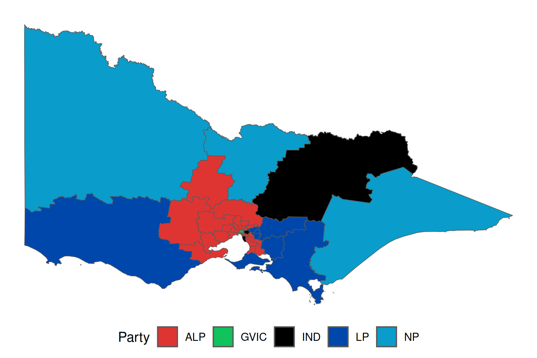
Zoom
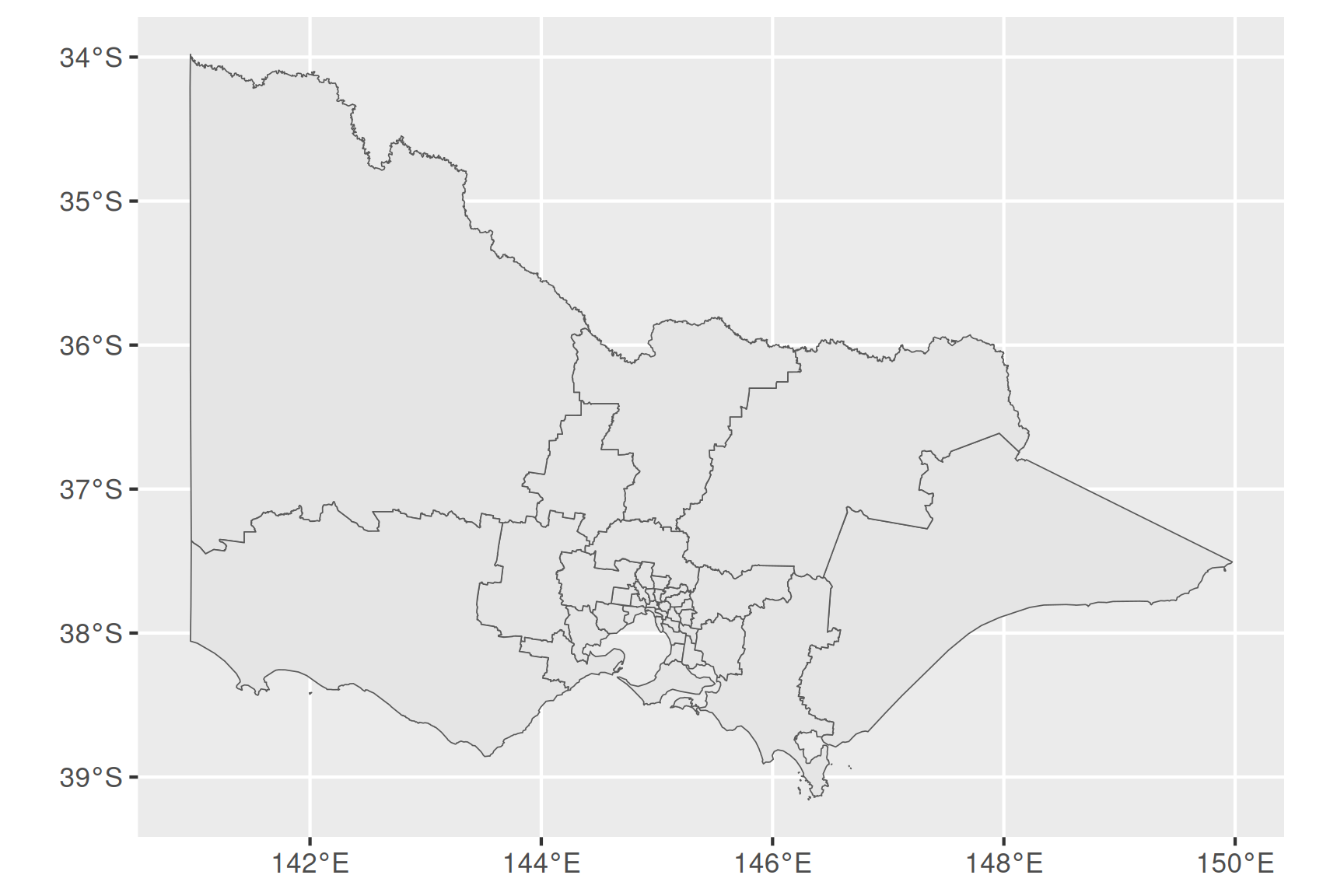
Traditional Maps
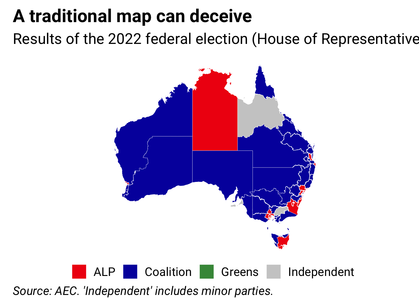
Hex Maps
Geographic coordinate reference systems

Projected coordinate reference systems
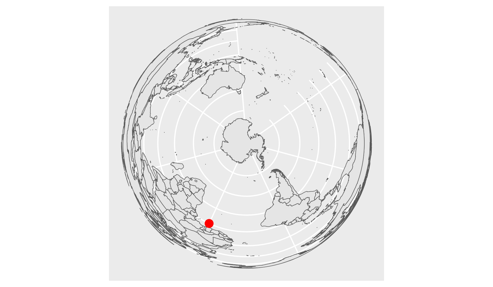
GDA94 Map Projection
Changing map projections