Getting started in ggplot2

*Based on notes from Kate’s unit on data Visualisation and Communication ETX2250/ETF5922

Shrek

Shrek and ggplot2

ggplot2 is just like Shrek!

It has layers!

Once you get to know it better you’ll love it!

“Ogres have layers. Onions have layers. You get it? We both have layers” - Shrek

The Layers

  • Data:
    • The dataset you’re visualising.
  • Aesthetic Mappings (aes() for short):
    • Map variables to visual properties like x, y, color, size, etc.
  • Geometries (geom_*):
    • Define the type of plot (e.g., bars, lines, points).
  • Scales:
    • Control how data maps to aesthetics (e.g., axis limits, color gradients).
  • Facets:
    • Split the data into multiple panels (e.g., facet_wrap()).
  • Themes:
    • Customise the non-data components (e.g., background, grid lines).

Base Layer

Start by creating an empty plot on which to add your layers. We’ll add layers to this plot using + (not |>)

library(tidyverse)

ggplot()

Data Layer

Data

  • First step is to add our data

  • I’m going to use the data we tidied in Tutorial 4

census_path <- here::here("data/2021_GCP_all_for_VIC_short-header/2021 Census GCP All Geographies for VIC/")

STE_paths <- glue::glue(census_path, "{geo}/VIC/2021Census_G17{alpha}_VIC_{geo}.csv",
                        geo = "STE", alpha = c("A", "B", "C"))

data_paths = STE_paths

# Read in each of the three tables
tbl_G17A <- read_csv(data_paths[1])
tbl_G17B <- read_csv(data_paths[2])
tbl_G17C <- read_csv(data_paths[3])

# Combine all the data together
tbl_G17 <- bind_rows(tbl_G17A, tbl_G17B, tbl_G17C)

# Change the format of the table to make it longer instead of wider
# This is a step closer to a tidy format
tbl_G17_long <- tbl_G17 |>
  pivot_longer(cols = -1, names_to = "category",
               values_to = "count")

# We want to split the strings using the "_"
# But there are multiple different cases to consider

tbl_G17_long_formatted <- tbl_G17_long |>
  filter(!str_detect(string = category, pattern = "Tot"),
         !str_detect(category, "PI_NS")) |>
  mutate(
    category = str_replace(category, "Neg_Nil_income", "-Inf_0"),
    category = str_replace(category, "Neg_Nil_incme", "-Inf_0"),
    category = str_replace(category, "Negtve_Nil_incme", "-Inf_0"),
    category = str_replace(category, "more", "Inf"),
    category = str_replace(category, "85ov", "85_110_yrs"),
    category = str_replace(category, "85_yrs_ovr", "85_110_yrs"))

# The data can be converted to the tidy format
tbl_G17_tidy <- tbl_G17_long_formatted |>
  mutate(category = str_remove(category, "_yrs")) |>
  separate_wider_delim(cols = category, delim = "_",
                       names = c("sex", "income_min", "income_max", "age_min", "age_max")) |>
  unite("income", c(income_min, income_max), remove = FALSE) |>
  unite("age", c(age_min, age_max), remove = FALSE)

Data view

head(tbl_G17_tidy, 20)
# A tibble: 20 × 9
   STE_CODE_2021 sex   income  income_min income_max age   age_min age_max count
           <dbl> <chr> <chr>   <chr>      <chr>      <chr> <chr>   <chr>   <dbl>
 1             2 M     -Inf_0  -Inf       0          15_19 15      19      88386
 2             2 M     -Inf_0  -Inf       0          20_24 20      24      21186
 3             2 M     -Inf_0  -Inf       0          25_34 25      34      17702
 4             2 M     -Inf_0  -Inf       0          35_44 35      44      12908
 5             2 M     -Inf_0  -Inf       0          45_54 45      54      13821
 6             2 M     -Inf_0  -Inf       0          55_64 55      64      20775
 7             2 M     -Inf_0  -Inf       0          65_74 65      74      21425
 8             2 M     -Inf_0  -Inf       0          75_84 75      84       9115
 9             2 M     -Inf_0  -Inf       0          85_1… 85      110      3158
10             2 M     1_149   1          149        15_19 15      19      35243
11             2 M     1_149   1          149        20_24 20      24       8674
12             2 M     1_149   1          149        25_34 25      34       3296
13             2 M     1_149   1          149        35_44 35      44       2511
14             2 M     1_149   1          149        45_54 45      54       3317
15             2 M     1_149   1          149        55_64 55      64       5483
16             2 M     1_149   1          149        65_74 65      74       7602
17             2 M     1_149   1          149        75_84 75      84       3604
18             2 M     1_149   1          149        85_1… 85      110      1214
19             2 M     150_299 150        299        15_19 15      19      18874
20             2 M     150_299 150        299        20_24 20      24      17995

Wrangle data for plotting

Create frequency data grouped by sex and income.

tbl_G17_tidy$income <- fct_reorder(tbl_G17_tidy$income,
                                   as.numeric(tbl_G17_tidy$income_min))

data_for_plotting = tbl_G17_tidy |>
  filter(sex != "P") |>
  group_by(sex, income) |>
  summarise(count = sum(count, na.rm = TRUE)) |>
  ungroup()

Want something like this
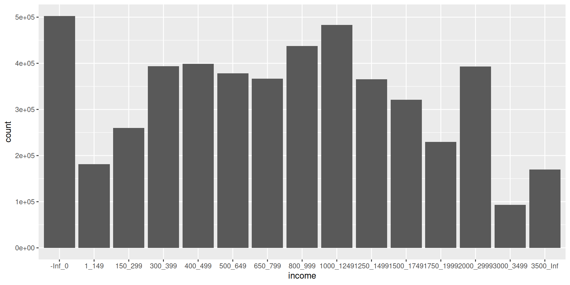
data_for_plotting |>
  ggplot() +
  geom_col(aes(x = income, y = count, fill = sex), position = "dodge") +
  ggtitle("5. Sex & income distribution in Victoria from 2016 Census") +
  theme_bw(base_size = 12) +
  theme(axis.text.x = element_text(angle = 90, vjust = 0.3))

Add you data layer

ggplot(data = data_for_plotting) 

It’s still an empty plot because we haven’t told R what to do with the data yet.

Geometry Layer (geom)

geom

  • The geometry is the type of plot you want to create
    (e.g line, scatter, bar, heatmap etc.)

  • Let’s create a coloumn plot

  • Use the geometry layer - geom_col

  • Similar to geom_bar (but does slightly different things)

  • If you type ?geom_ in your Console and hit tab to scroll through a list of all the different plot geometries

Bar Plot

Add your geom

This is what your code should look like when you add your geom layer

# ggplot(data = data_for_plotting) +
#   geom_col()

Warning

  • But … this code won’t work yet, because we haven’t added our aesthetic layer

  • The aesthetic layer defines how data is mapped to visual properties in your plot

    • e.g what goes on the x/y axes

Aesthetic Layer

Common Aesthetic Mappings

Use the aes() function to map variables to aesthetics.

The common parts are:

  • x: The variable on the x-axis.

  • y: The variable on the y-axis.

  • color: The color of points, lines, or outlines.

  • fill: The fill color for bars, areas, or shapes.

  • size: The size of points or lines.

  • shape: The shape of points (e.g., circles, triangles).

  • alpha: The transparency level.

Adding the aesthetic layer

Let’s start with x and y.

ggplot(data = data_for_plotting, aes(x = income, y = count)) +
  geom_col() 

Another Option

If you are going to use multiple data types or need multiple aesthetics layers it is better to put the code about the data and the aesthetics in the same geom layer.

ggplot(data_for_plotting) +
  geom_col(aes(x = income, y = count))

Colour and Fill

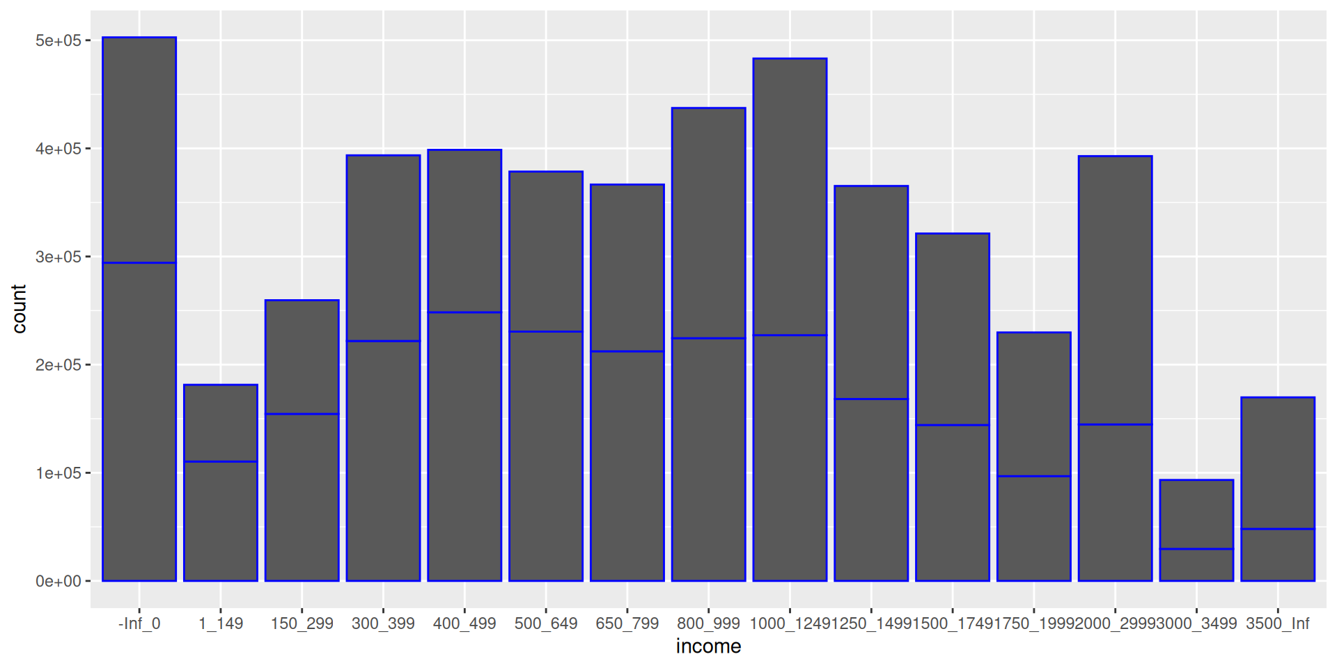
Set the bar colour to blue

ggplot(data_for_plotting, aes(x = income, y = count)) +
  geom_col(col = "blue") 

Note col in geom_col is short of column, but typically col stands for colour.

Colour and Fill

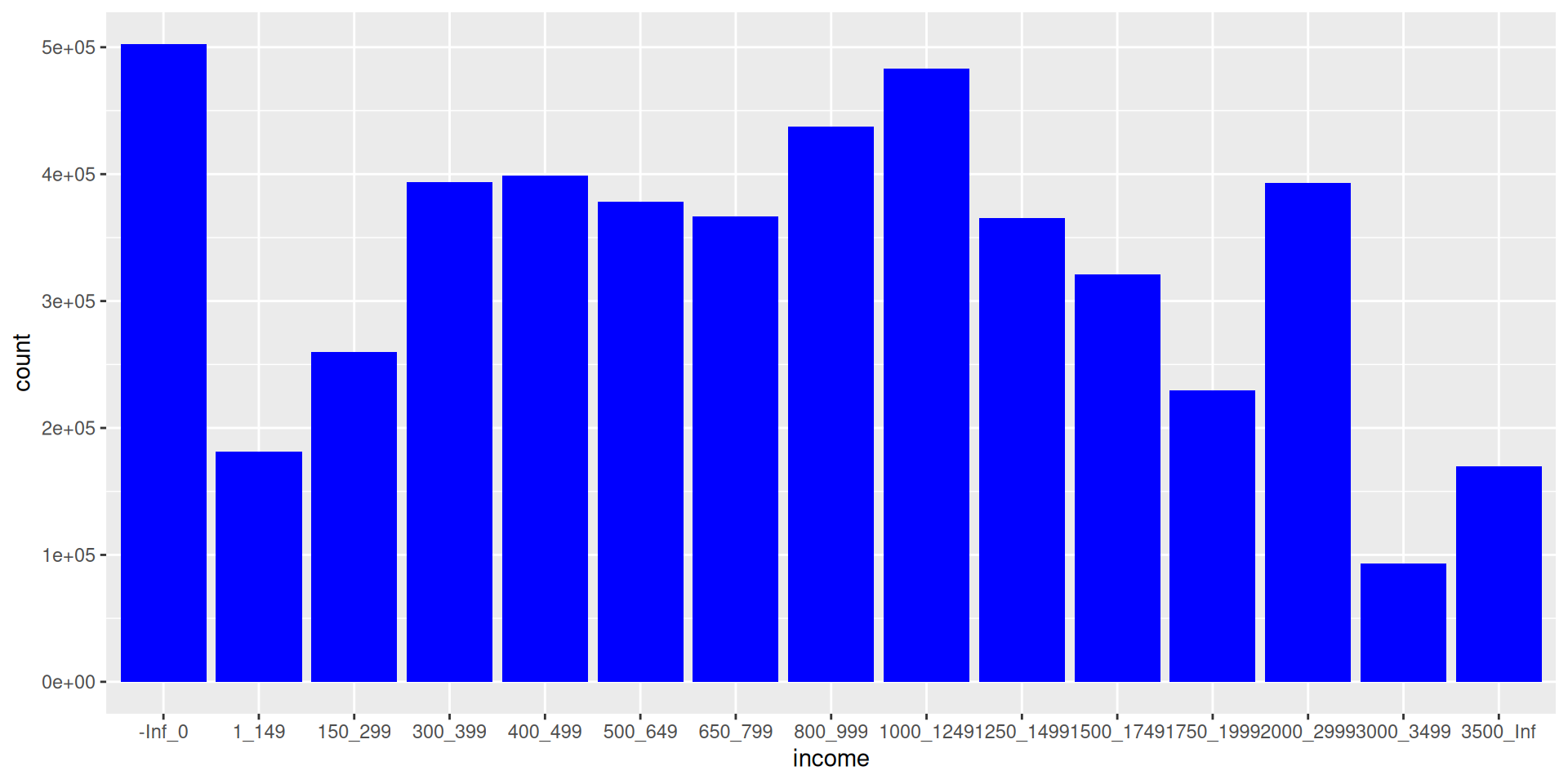
Set the bar fill to blue

ggplot(data_for_plotting, aes(x = income, y = count)) +
  geom_col(fill = "blue") 

Colour and Fill

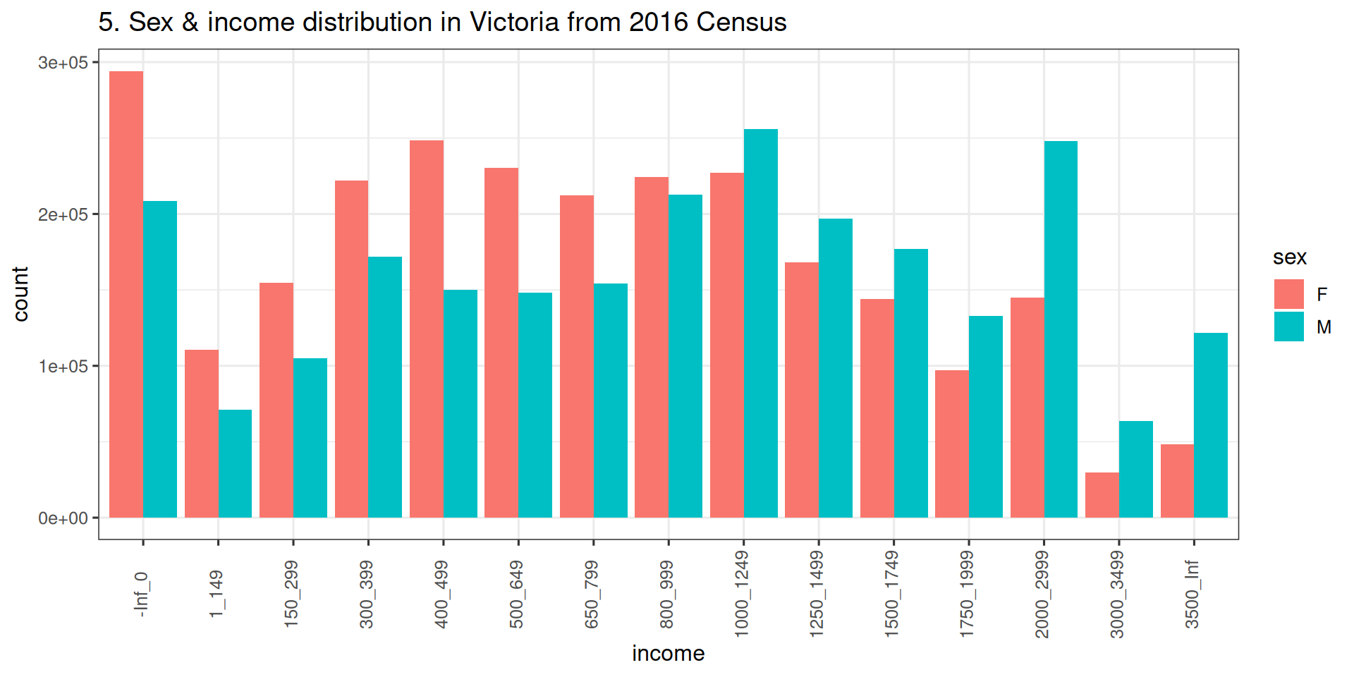
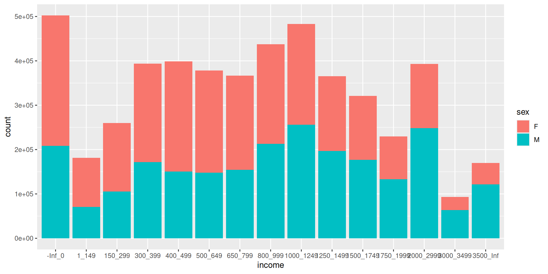
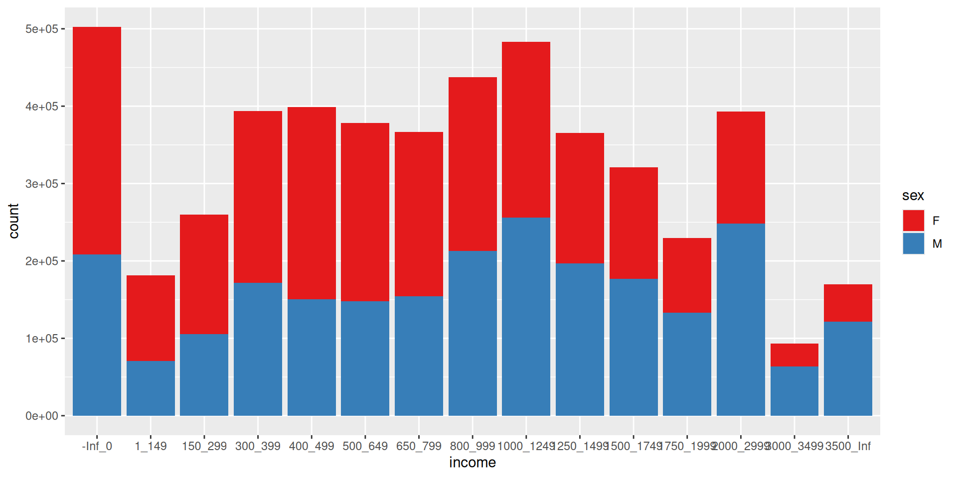
Set the bar fill using the sex variable.

ggplot(data_for_plotting, aes(x = income, y = count, fill = sex)) +
  geom_col() 

Colour and Fill In Code

Common misunderstandings

  • If you want to colour/fill by the name of a variable then you need to put it in the aesthetic mappings (e.g. aes() brackets)

  • If the colour/fill is fixed, (e.g. you want to colour everything black), then the input is just in the geom_*() bracket.

  • Depending on what geom you use, there may be a difference between colour and fill

  • Both spellings of colour and color will work

Scale Layer

Scales

Next layer in the visual elements is scale. e.g. axis limits and color scales

Let’s try a silly example where we manually assign colours.

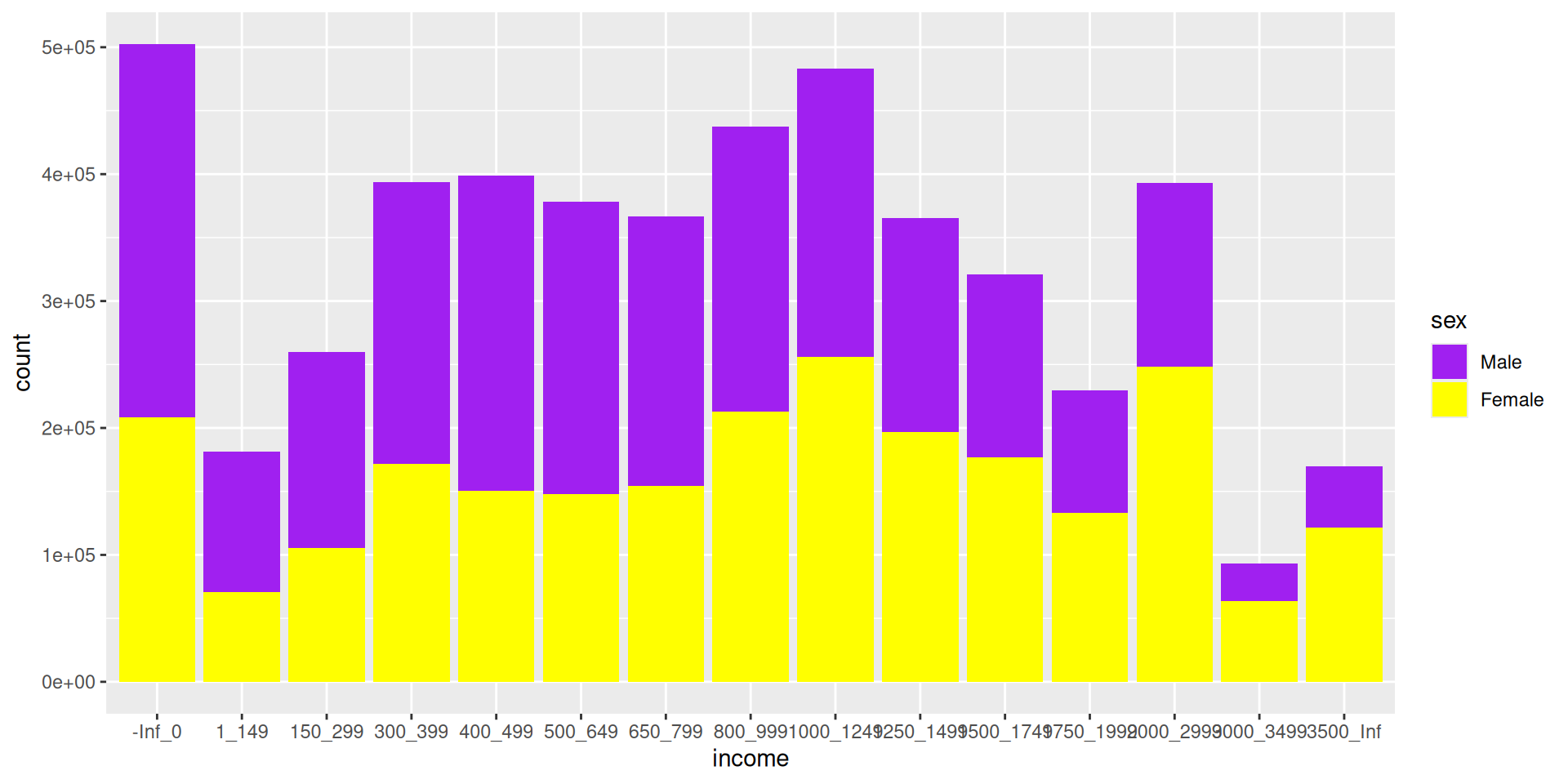
Defining manual colour scales

ggplot(data_for_plotting, 
       aes(x = income, y = count, fill = sex)) +
  geom_col() + 
  scale_fill_manual(
    label = c("Male", "Female"), 
    values = c("M" = "yellow", "F" = "purple"))

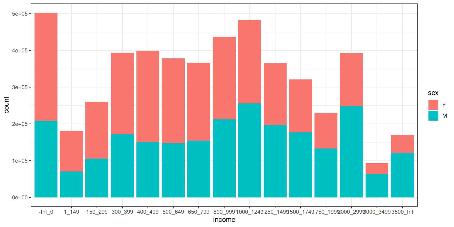
Using In Built Fill/Colour Scales

You can use the inbuilt palettes from RColourBrewer

ggplot(data_for_plotting, aes(x = income, y = count, fill = sex)) +
  geom_col() + 
  scale_fill_brewer(palette = "Set1")

Fill/Colour Scales

Fill/Colour Scales

IMO: Fill/colour scales are one of the hardest parts about learning ggplot2

  • To change colour scale, use scale_colour_*

  • To change fill scale, use scale_fill_*

  • Check out all the different types of scales using the help menu ?scale_ and hit tab.

  • Note for discrete variables needing distinct colours, such as categorical variables, you can use scale_*_brewer

  • For variables needing a smooth gradient use scale_*_distiller

  • You can also set colours manually using scale_*_manual

Note * here is like a blank space and it means there are multiple things that could be inserted here

Themes

Themes

  • Here is a list of the themes.

  • My favourite is theme_bw().

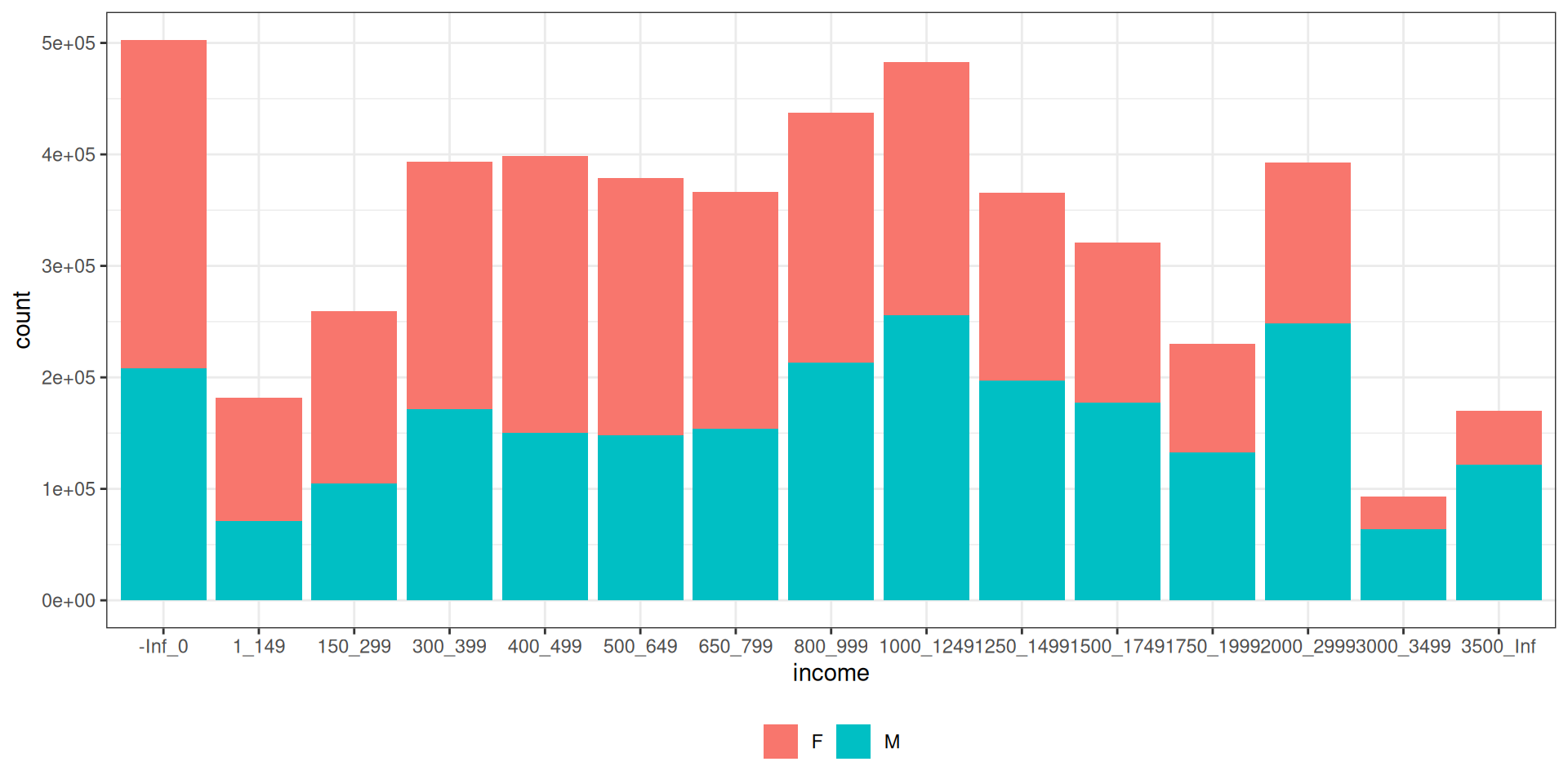
Changing Theme Background

Here I change the theme background to theme_bw().

ggplot(data_for_plotting, aes(x = income, y = count, fill = sex)) +
  geom_col() +
  theme_bw() 

Plot Theme Specifics

Plot Theme Specifics

  • To tune the more specific aspects of your theme, we use the theme() layer.

  • Look up ?theme there are a lot of options!

Changing Theme Specifics

Here I move the legend to the bottom and remove the legend label.
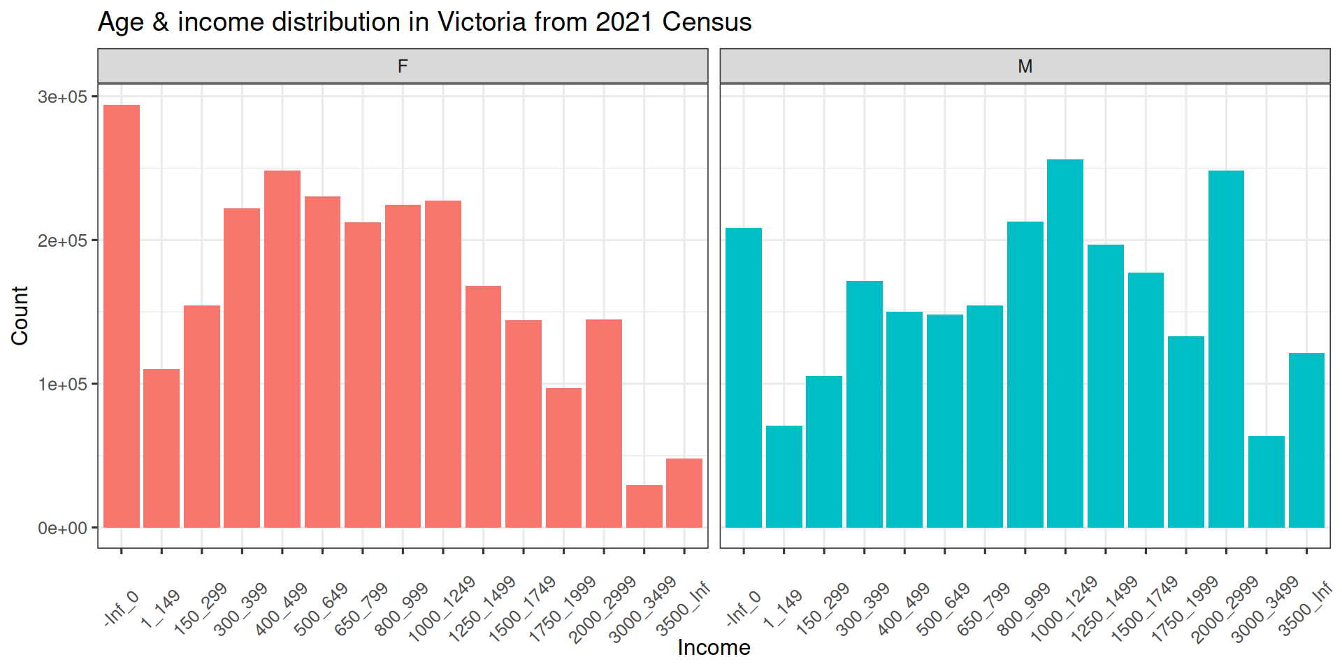
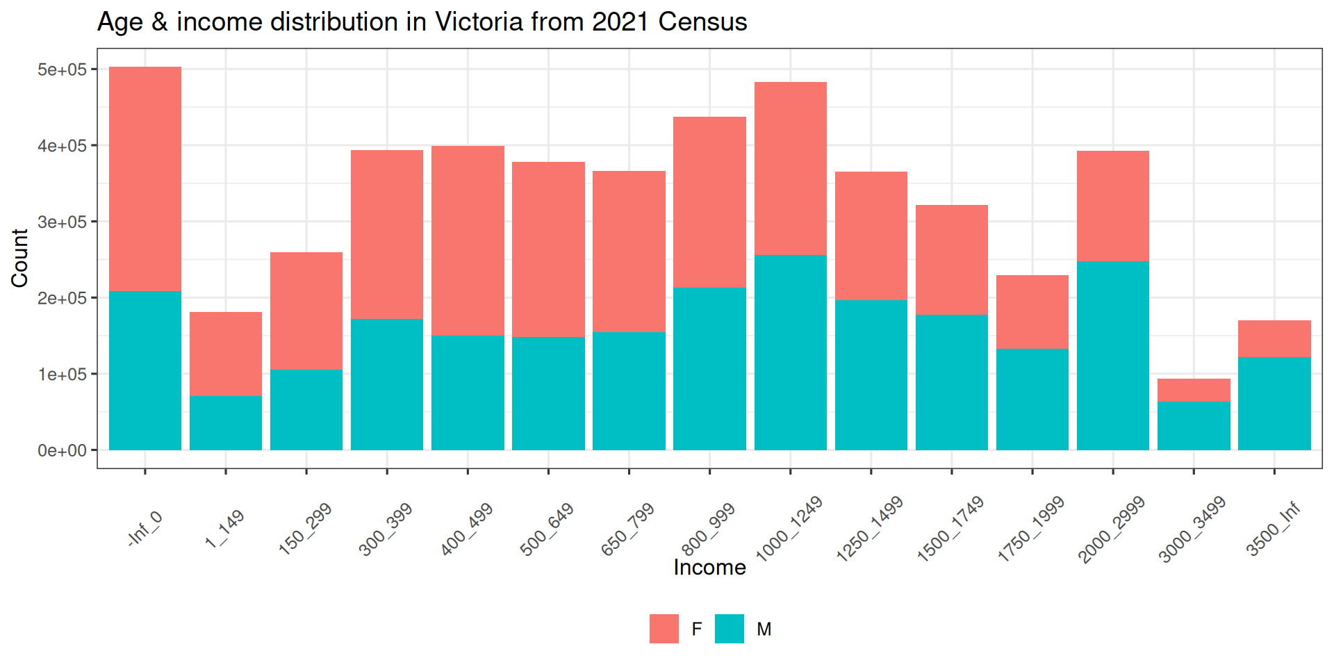
ggplot(data_for_plotting, aes(x = income, y = count, fill = sex)) +
  geom_col() +
  theme_bw() +
  theme(legend.position = "bottom", legend.title = element_blank())

Polising your plot

The theme() layer is also were you can specifics about titles, text and axes. You could also change label names in the theme using labs()

final_plot <- ggplot(data_for_plotting, aes(x = income, y = count, fill = sex)) +
  geom_col() +
  theme_bw() +
  theme_bw(base_size = 12) +
  labs(
    title = "Age & income distribution in Victoria from 2021 Census",
    x = "Income", 
    y = "Count"
  ) + 
  theme(legend.position = "bottom", 
        legend.title = element_blank(),
        axis.text.x = element_text(angle = 45, vjust = 0.3)) 

Final plot

final_plot

One last example: Facets

ggplot(data_for_plotting, aes(x = income, y = count, fill = sex)) +
  geom_col() +
  facet_wrap(~sex) + 
  theme_bw() +
  theme_bw(base_size = 12) +
  labs(
    title = "Age & income distribution in Victoria from 2021 Census",
    x = "Income", 
    y = "Count"
  ) + 
  theme(legend.position = "none",
        axis.text.x = element_text(angle = 45, vjust = 0.3)) 

One last example: Facets