library(tidyverse)
library(sf)
SA1map <- read_sf(here::here("data/Geopackage_2016_EIUWA_for_VIC/census2016_eiuwa_vic_short.gpkg"), layer = "census2016_eiuwa_vic_sa1_short")Week 6 Tutorial
Learning Objectives
In this tutorial, you will be combining data from the Australia election and the Australian census.
NoteYou will be learning how to:
- Integrate data from different source to make exploratory inferences
- Compare summary statistics by region using different geographical statistics
- We will use the 2016 census data (you will use 2021 data on your assignment)
Before your tutorial
1. Get the geographical boundaries for 2016 census regions.
2. You will also need the data for the 2018 electoral boundaries.
Exercise 1
Read in the data from different sources
- Import the 2016 GeoPackage data with SA1 regions.
- Calculate the centroids for each SA1 region.
SA1map <- SA1map |>
mutate(centroid = st_centroid(geom))- Read in the data containing the electoral boundaries.
vic_map <- read_sf(here::here("data/vic-july-2018-esri/E_AUGFN3_region.shp")) |>
   # to match up with election data
   mutate(DivisionNm = toupper(Elect_div))
Exercise 2
Integrate in the data from different sources
- Plot the median weekly personal income data on top of the electoral boundaries like below. Can you find which regions have wealthy individuals?
ggplot() +
   geom_sf(data = SA1map, aes(geometry = centroid, color = Median_tot_prsnl_inc_weekly), shape = 3) +
   geom_sf(data = vic_map, aes(geometry = geometry), fill = "transparent", size = 1.3, color = "gray") +
   coord_sf(xlim = c(144.8, 145.2), ylim = c(-38.1, -37.6)) +
  scale_color_viridis_c(name = "Median weekly\nperson income", option = "magma") +
  theme_minimal()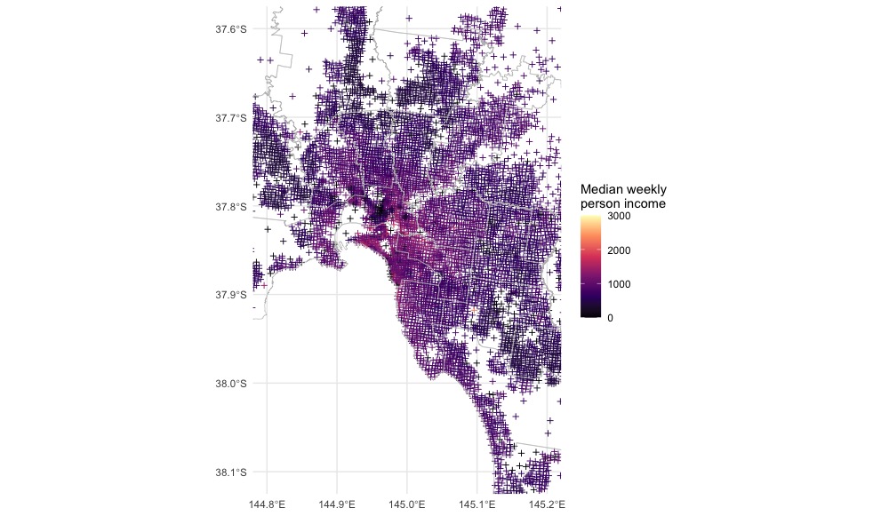
- Estimate a median weekly personal income for the Melbourne district.
For discussion
NoteThink about your results
Looking at the map above, there is one electorate won by the Green party. Notice, this is where a lot of wealthy individuals live.
Can you say that those who vote for the Green party are rich individuals? Why or why not? Discuss with your classmates.
Why do some geographical regions look sparse in terms of the census reported median weekly personal income?
What is ecological fallacy? How does it relate to your conclusions from before?
Exercise 3: In your own time
Compare with different a layer
Repeat Exercise 2 using the SED regions. How does the estimate of median weekly personal income for the Melbourne district differ? What about estimates in other districts?
SEDmap <- read_sf(here::here("data/Geopackage_2016_EIUWA_for_VIC/census2016_eiuwa_vic_short.gpkg"),
                  layer = "census2016_eiuwa_vic_sed_short")
Important
Reminder the SED regions are NOT the same as the commonwealth electoral boundaries!!! And CED regions are not exactly the same as the federal electoral boundaries either!!!